
Website
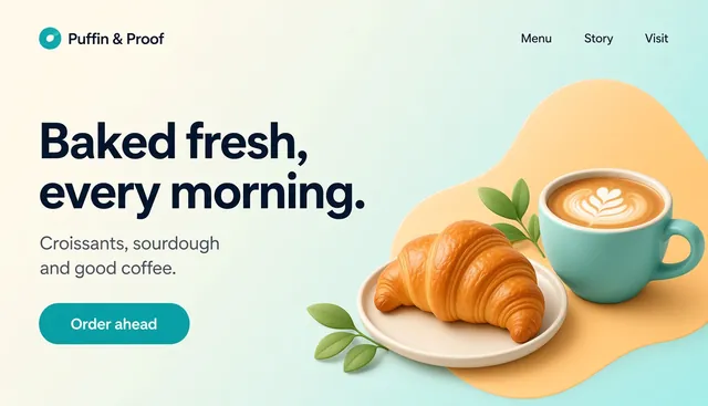
Puffin & Proof: bakery & café website with shop pages
By Templates.party
Warm café landing page plus product, checkout, order-confirmed and login pages, with a working demo cart.
Pay what you wantLive demo
A tactile UI kit with keys that press, knobs that turn, faders and LCD readouts: 52 elements, 40 sections and 9 page layouts as HTML + Tailwind CSS and typed React components, with light and dark tokens and a docs site.
 By Templates.party
Dial borrows from good hardware: raised keys that sink when you press them, knobs you can turn with a mouse, arrow keys or a drag, and glowing readouts that make numbers feel alive. Under the look it is plain Tailwind with one set of design tokens, so you can recolor everything from one file. Every piece comes as copy-paste HTML and as a typed React component, and the docs site shows each one live with its code.
The kit at a glance, with a live control surface you can play with.
Open in the demo (opens in a new tab)All 52 elements live, each with its HTML and React code: keys, knobs, faders, inputs, LCDs and more.
Open in the demo (opens in a new tab)40 ready sections: heroes, features, stats, testimonials, FAQ, footers, app shells and more.
Open in the demo (opens in a new tab)Nine complete pages to start from, each one opens on its own.
Open in the demo (opens in a new tab)#15161A#3142D8#8BE36B#F2A33A#ECE7DD#121317Archivo + JetBrains Mono (free, OFL; included)
The swatches are the kit’s default tokens. Change them in one file and every element follows, in light and dark.
All people, companies, numbers and messages in the demo are fictional sample content. Sample photos are AI-generated. Dial UI Kit is not affiliated with Tailwind Labs, React or Lucide. Use the kit in apps, sites and client work; just don’t resell the kit itself as a UI kit.
Pay what you want, once: no subscription. Use it for your own business or for client work, on unlimited projects. You can’t resell or redistribute it as a template. Full terms.
Whatever amount you choose, every order includes MCP access: sign in once with your email and AI assistants like Claude, ChatGPT or Cursor can read, customize and download your templates. New ones join the same connection on their own.
By Templates.party
Warm café landing page plus product, checkout, order-confirmed and login pages, with a working demo cart.
By Templates.party
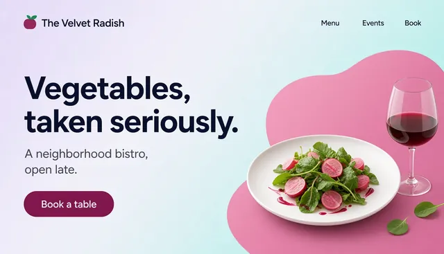
Dark, editorial one-page site: tabbed menu, chef story, private dining and a reservation form.
By Templates.party
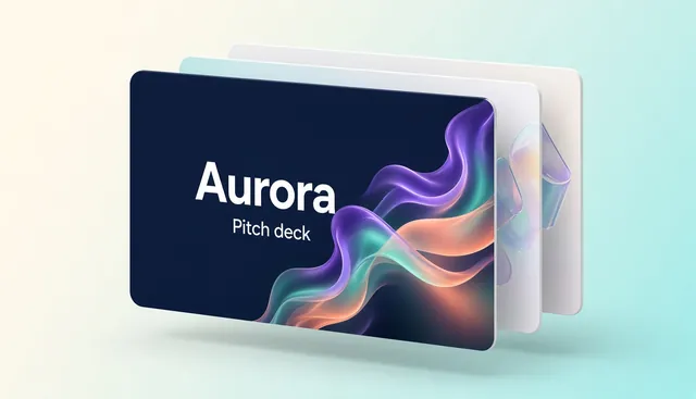
Airy 12-slide investor deck with aurora glows: problem, solution, market, model, traction, team and the ask.
By Templates.party
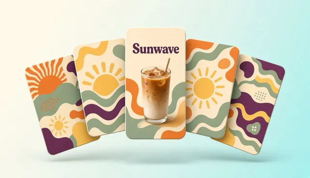
Twelve warm designs for Instagram, TikTok and LinkedIn as layered SVG plus ready-to-post PNG, with fonts.

Every niche is on the guest list. Find the template that fits your next project.